
Charting Your Course #3: Self-Publish Online (Part 2)
By Gale Leach
This article follows three earlier posts published on the Writers in the Storm blog:
• Charting Your Course: How should you publish?
• Charting Your Course #2: Self-Publishing in 2025
• Charting Your Course #3: Self-Publishing Online (Part 1) [add hyperlink]
These posts explore the pros and cons of self-publishing, examine today’s self-publishing landscape, and conclude with the practical steps for self-publishing your book.
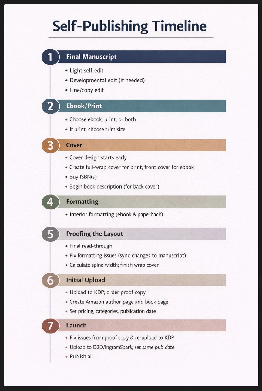
To remind you where we left off, the last post took us through 1) finishing the manuscript, 2) deciding whether to create an ebook, print book, or both, along with choosing a trim size, and 3) designing the cover. Now we begin with 4) Interior Design. Correlate the information shown in Fitzpatrick's article with my timeline (below) and the numbered steps that follow. https://www.usefulbooks.com/learn/self-publishing-checklist
4. Interior Design—Ebooks
Interior design is the process of attractively arranging text and images, if any, on a page in order to create a pleasant reading experience. The cover attracts buyers; the interior design keeps them reading through consistency, readability, good use of white space, and a visual style that matches the genre.
For an Ebook
If your book is mostly text, an ebook should be simple to format and lay out. The goal with ebooks is to keep things simple. They must look good on so many different devices—that means you should not format your text in elaborate ways. Look at other ebooks you like and emulate what they do. If your ebook has many graphics, it would be wise to find help.
Most platforms accept Word documents and can convert them automatically to EPUB, the standard ebook format. (MOBI, the older Kindle format, has largely been phased out in favor of EPUB, and PDF is not recommended.)
If you have images or designs, you will still need to work on the layout, which can be complicated. I suggest getting help with this.
Ensure your file is clean: consistent chapter headings, proper scene breaks, no manual tabs or extra spaces, and a linked table of contents where appropriate. Keep your ebook file neutral; nothing fancy. Fitzpatrick writes more about this in his Section 3.1.
After upload, ebooks typically appear on Amazon within 24–72 hours.
Ebook Pricing Strategy
Typical debut pricing ranges:
Ebook novel: $2.99 – $4.99
Ebook nonfiction: $5.99 – $9.99
For a Print Book
Print book interior design includes:
- Trim Size: The book’s height and width. The most common trim sizes for standard trade fiction and nonfiction books are 5″ x 8″, 5.5″ x 8.5″, and 6″ x 9″, with 6″ x 9″ being the standard for mass market fiction (e.g., novels) and nonfiction in the United States. You will need to decide which trim size you want before sending the book to a designer or printer or forging ahead with more tasks. The trim size you choose directly affects the page count of your book, and the page count determines the spine width. A 5″ x 8″ book coming in at 400 pages would only be 298 pages when set at 6″ x 9″.
- Binding: The most common types of binding are hardcover, paperback, and spiral or coil. More people are buying hardcovers now, partly because of #BookTok and the aesthetic appeal of beautiful books on their shelves. The best binding for your book will be determined by page count, price (hardcovers are more expensive to produce than paperback), and trim size. I had a client who wanted to print a cookbook and we chose a spiral binding so it could lie flat, but those are rare. Not all bindings are available for all trim sizes. Before deciding on your binding or trim size, make sure KDP, D2D, IngramSpark, or your local printer can accommodate your needs.
- Typography: Choose readable serif fonts (e.g., Garamond, Minion Pro, Palatino, Charter) for the body text, typically in 11 or 12-point size. I recommend not using decorative fonts unless they are extremely easy to read. A decorative letter at the start of a chapter is common, but refrain from much more than that.
- Widows and Orphans: Avoid leaving single lines of a paragraph alone at the top or bottom of a page.
- Too Much Text Per Page: Don’t cram content to save on printing costs because it makes the book hard to read.
- Margins and Gutter: Leave sufficient white space, specifically a wider inner margin (known as the gutter—at least 0.75 inches to account for binding), usually with outer/top/bottom margins around 0.5 inches. If you make the inside margin too small, the text will disappear into the spine.
- Chapter Openers: Many authors start new chapters roughly one-third to halfway down the page (sinkage). It’s also common to use stylized chapter numbers, headings, or drop caps.
- Paragraph Alignment: You must choose between ragged-right or justified text.
- Ragged-right has a consistent word spacing. Words are aligned on the left, with an uneven, "ragged" edge on the right. This is generally easier to read because of consistent spacing between words.
- Justified text: Space is added between words to make every line the same width. This creates a clean, block-like look but can produce “rivers” of white space between words. It aligns both margins, creating a more professional appearance, but it requires careful formatting to avoid uneven spacing.
- Running Headers/Footers: These are the page numbers and small lines of text that appear at the top and bottom of pages within the margin. Elements that might be included are the author name, book title, and/or chapter name for navigation. Typically these appear on most pages except chapter openers. Typically, I place the author name in the top margin of the left-facing (verso) page, with the chapter name in a running header at the top of the right-facing (recto) page.
- Front and Back Matter: This consists of the title page, copyright page, table of contents, dedication, author bio, and other elements. An accepted standard exists for the order of these items. If you’re curious, see Kindlepreneur: Parts of a Book.
- Bleed: Typically, this pertains to covers, where the image extends all the way to the edge of the printed page, but any graphic in your book can be set to bleed, and those must also be set to 0.125 inches beyond the trim line. Note: If you set one graphic to bleed in your interior file, all of your pages will need to be sized to include that 0.125 amount of space.
Prepare Print Book Files
Once your layout is complete, it's time to make the PDF you will upload to KDP.
Now that you have the ISBN, you can finalize your print book files in preparation for upload. The ISBN graphic goes in the bottom right corner of the back cover. The price of the book can be included in the ISBN (or not, if the price might change). Your imprint name can be listed on the back cover and included in the front matter on the copyright page. You list the book’s metadata on the form when you upload your print book or ebook.
Print Book Pricing Strategy
Typical debut pricing ranges:
Paperback novel (200-300 pages): $12.99 – $16.99
Paperback nonfiction (120-180 pages): $12.99 – $16.99
Paperback nonfiction (200-300 pages): $16.99 – $21.99
Paperback nonfiction (premium/academic/technical): $22.99 – $29.99
Royalties
I won’t go into the details of royalties here, as they’re well explained on KDP’s site, but here is one example for a 250-page 6×9 paperback:
Printing cost: about $4.50–$5.50
Retail price: $14.99
Royalty: roughly $4–$5 per copy
Items that factor into determining your royalty are the number of pages in the book, whether you’ve chosen a standard trim size, the weight and type of paper, etc.
5. Proof the Layout
Proofread the finished interior book file for errors in layout/design. Hopefully all other errors have been fixed. Use Kindle Previewer to check the ebook. If errors are found, synchronize fixes back to the original manuscript.
6. Initial Upload
Your finished upload should consist of two high-resolution PDFs (one for the cover and one for the interior with embedded fonts). You make these choices on the PDF creation screen.
I recommend you follow the progression below:
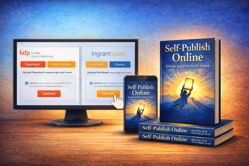
- Upload the ebook to Amazon KDP. Visit https://kdp.amazon.com and sign in (or create a new account). Amazon is the largest retailer of books in the world. You want your book there.
- Do NOT select expanded distribution. That will be handled through the following two uploads. Order and check through a proof of your print book. Ebooks can be proofed using electronic means.
- (Optional) Enroll in KDP Select for the first 90 days. This is a program requiring ebook exclusivity to Amazon in renewable 90-day periods. It offers access to Kindle Unlimited (KU) royalties, increased visibility, and promotional tools. Authors earn money based on pages read, can run free promotions or countdown deals, and may qualify for bonuses. After 90 days, you can unenroll and upload elsewhere. Disadvantages: Amazon earns between 30 and 65% of your sales; sample and author copies are subject to a charge; you may not upload to any other venues until 90 days elapses and you unenroll from the program.
- Upload to Draft2Digital. If you purchased your own ISBN, you can upload the same interior and cover file you sent to Amazon. If you used Amazon’s free ISBN, it belongs to Amazon, and you’ll need to get a new one from D2D or Bowker (the official ISBN agency for the United States). D2D will distribute the book (both ebook and print now) to many other retailers (check their website for a current list).
- Upload to IngramSpark. This is a subset of Ingram, the largest book distributor in the world. Bookstores, libraries, and schools order almost exclusively through Ingram. Uploading here provides easy access into their distribution system worldwide.
7. Launch
Before you click the “Publish” button at KDP or any other site, square away a few other things.
- Carefully check the proof copy. If you find errors, correct them in the file, re-upload, print a new proof, and keep that up until it’s correct. Each time you fix errors in the file, be sure to sync the changes with your initial manuscript as well (unless they are printer errors).
- Choose a publication date far enough in advance that you can send out advance review copies (ARCs), generate interest on social media and through your newsletter (something you should have been leading up to), and accrue presales. If you upload to more than just KDP, set your pub dates to be the same so your book will be available on all platforms at once.
- Prepare your launch and your publicity—then sit back and bask in the joy of being a published author!
Final Thoughts
Independent authors have access to global publishing tools that were once available only to major publishers. The hardest step is finishing the manuscript. Once that’s done, publishing becomes a series of manageable steps.
Knowledgeable professionals are available to help you get your book to market. Beware of fraudulent businesses that take your money and deliver little to nothing. Check Preditors and Editors (currently on Facebook while their website is rejuvenated) for help determining the goodness of a potential partner.
I have learned on my own how to do the steps outlined here and more when it was harder than it is today. I’ve watched others do so, too. Your previous computer experience will have a bearing on your comfort with the process, but it is something you can do, if you decide to do it. Also, people in your various writing groups can coach you through the sticky spots.
I wish you success! If you find this article helpful, please let me know. Good luck!
Reference:
Fitzpatrick, Rob. “The big self-publishing checklist.” Useful Books, March 4, 2025.
https://www.usefulbooks.com/learn/self-publishing-checklist
What part of the self-publishing process feels most overwhelming to you right now, and why?
About Gale
Writing The Art of Pickleball in 2005 launched Gale Leach’s career as an award-winning author. From 2011 to 2020, she also managed her own company, Two Cats Press, which published the works of six Arizona authors, including seven of her own fantasy adventure novels for children and teens. Currently, she’s at work on a fantasy trilogy involving magic, technology, multiple worlds, and creatures you only thought were mythological.
Gale and her hero husband live in Arizona, accompanied by two cats and a bearded dragon. Gale’s interests outside of writing include singing, playing music, genealogy, reading, crafting, and many types of puzzles and games. You can connect with Gale on social media or her website.
Header Image created by Gale Leach using ChatGPT
Leave a Reply
7 comments on “Charting Your Course #3: Self-Publish Online (Part 2)”
Tagged as:
Subscribe to WITS


Recent Posts
- Charting Your Course #3: Self-Publish Online (Part 2)
- The Blueprint that Sells Books
- 5 Things Award-Winning Books Have in Common
- When Deep POV Revisions Feel Flat (And What To Fix Instead)
- The Author Who Cannot Write (About Themselves)
Thanks for summing these up, Gale.
To clarify a couple of points: choosing Kindle Unlimited does mean not taking Draft2Digital or other ebook options. Also, Draft2Digital has a print option too, and IngramSpark has an ebook option, but both of those are worth avoiding.
And, Amazon, D2D, and Ingram can refuse to let you share your own ISBN between them. The fix for that is to be sure you have drafts with the ISBN saved on all of them before you publish any.
Thank you, Ken, for the clarifications. In this ever-changing field, I appreciate all the help I can get trying to keep track.
Great summary Gale. And from someone who has actually done the work well, this is powerful. The part that feels most overwhelming to me these days is just getting it all done while running a publishing house. LOL I love the way the layout tools are improving daily!
Thank you, Lisa. Praise from you means a lot, as I know you are in the thick of so many things and doing all of them well. And I agree—anything to make the job easier, as long as it doesn't become one size fits all.
"Margins and Gutter: Leave sufficient white space, specifically a wider inner margin (known as the gutter—at least 0.75 inches to account for binding), usually with outer/top/bottom margins around 0.5 inches. If you make the inside margin too small, the text will disappear into the spine."
Some traditional publishers need to pay attention to this one for their paperbacks. I hate having to pull the book apart in order to read it, requiring the use of 2 hands. How am I supposed to hold my wine glass?
OMG, that's just it!
But perhaps the traditional publishers are not as interested in readability as they are in conserving paper and ink.
Thanks for bringing a smile today!
Wonderful post, Gale!
Everything about the self-publishing process is made easier by your posts. So, thank you for those!
I find getting everything just so for the interior the most tedious, but practice makes perfect, right?!