
Book Cover 101: Mystery/Thriller

by Melinda VanLone
Last time here at Book Cover 101 we talked about how romance cover trends are changing in a huge way toward more illustrations instead of photography, but they aren’t the only covers that are shifting with the times.
Today let’s take a look at another huge genre category: Mystery/Thriller. While that’s really two genres I’m lumping them together because their covers play in the same sandbox, with slight variations. This includes psychological thrillers, spy thrillers, legal thrillers, police procedurals, private detective, and noir. Cozy mysteries have been and still are a little different from the rest, but I’ll cover them as well.
Trends in Mystery/Thriller Book Covers
Generally, the majority of mystery/thriller covers have always included darker tones, often with silhouetted figures rather than the faces you used to see on romances, except for cozy which almost always featured fun illustrations.
But these days, the tonal shift leans more toward an action movie poster vibe, rather than an ominous one.
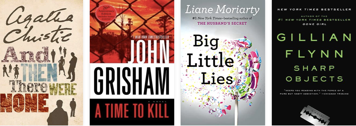
For example, check out these bestsellers from a mere decade or two ago:
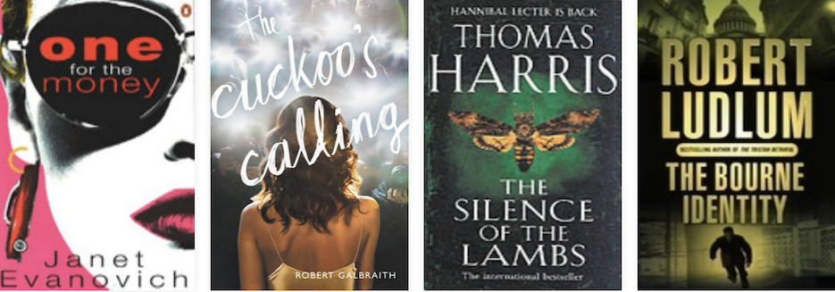
Notice the tones…black, or off-black, or angry red but not bright red. In particular, notice the fonts. The biggest change I see lately is in the typography.
These older covers have plain fonts, for the most part. A lot of them use Futura or Helvetica (Arial). They’re mostly just stuck on there, with the author name being huge and the rest…meh, an afterthought. The background image was very much an integral part of the message, especially on a cover like Silence of the Lambs (before they put the movie version on).
New Trends for Mystery/Thriller Covers
The trend now is a lot more in your face with the fonts. The background is basically there to serve up the title in a nice contrasty way. Silhouetted people are almost non-existent. For example, these “most read” covers of 2021-2022 according to Goodreads:
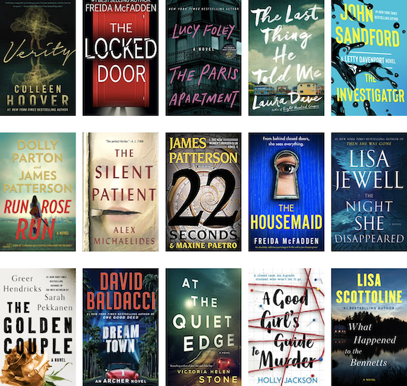
These covers would all make awesome action movie posters, which I think is the point of the current trend. One thing mystery/thriller covers have in common with romance these days is an aversion to real people/faces. At most, you get a view of someone’s back or a close-up of a body part.
I’m a huge fan of this trend because I think these covers are incredibly eye-catching. They make me want to click every time.
As with the current romance trend, though, I’m not sure they shout “mystery” or “thriller” anymore. I mean…unless murder is in the title, can you tell?
Trends in Cozy Mystery Book Covers
Cozy mysteries are shifting too, but it’s a lot more subtle. They still feature illustrations with a fun things-will-all-work-out-in-the-end vibe, but lately the artwork is less complex, and a bit brighter. For example, here are some bestsellers from a few years ago:
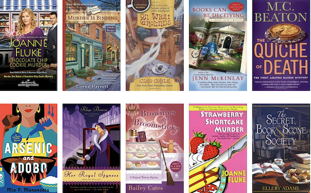
See the fun scenes and catchy titles? Today, it’s inching ever so slowly toward less complex artwork, with a little more emphasis on brighter colors. It’s a subtle change, though, and not one that makes a huge difference. All of these still shout about fun times with murder.

Overall, as with romance, mysteries and thrillers are shying away from showing faces in favor of graphics and typography. Again I think the reason behind this is that stock photography hasn’t kept up with the growing demand for quality photos of new and diverse models.
It’s a lot easier and cheaper to pay an artist to draw something, and a lot easier for said artists to put their creations up on stock sites, than it is to buy an expensive camera, pay a model, get releases, etc.
If you write mysteries or thrillers, and your sales have slowed, you might think about upping your cover game, especially with regard to the typography. Treat your title as the main artwork, and make it bigger and more eye-catching. Let the background image support the words, rather than the other way around.
Have you noticed any mystery/thriller cover trends changing that I’ve missed? Be sure to mention them in the comments! (I'm open for all cover questions.)
Next time, we’ll dive into Fantasy and Sci-Fi. Until then, thanks for reading!
* * * * * *
About Melinda

Melinda VanLone is a coffee addict, a cat lover, and avid writer of stories about rascally heroes and sassy heroines who live happily ever after in spite of themselves. She shares her house with her fur babies and the love of her life, Mr. Melinda, who spends most of his time at home huddled under blankets because the thermostat remains under her iron control.
When she's not playing with her imaginary friends you can find her designing covers that sell, taking brisk walks around the neighborhood and failing to resist the pistachio muffins at the nearest local coffee shop. Head on over to melindavan.com to check out her latest writerly doings, or hop over to bookcovercorner.com to peak at her cover designs.
9 comments on “Book Cover 101: Mystery/Thriller”
Tagged as:
Subscribe to WITS


Recent Posts
- Why Emotional Scenes Still Feel Flat
- Write What You Know? OR Not?
- The Beating Heart of Your Story—Structure
- The Real Reason You're Afraid to Publish
- Launching a Book With Confidence
These posts are always so fascinating to me, Melinda. I know I will absolutely NEVER make my own book cover though. LOL. I wouldn't have noticed the difference between the new and old cozy mysteries if you hadn't pointed them out to me (and put them side by side). Really interesting stuff...thanks for sharing!
Thanks Jenny! I think about this stuff every time I design a new cover...first to keep up with the market but mostly because I spend hours and hours hunting for fresh faced models for covers. I'd rather have a face, because it connects with the reader better, but when we end up with the same faces on so many covers that you can't tell the books apart it stops connecting and becomes...well, wallpaper. So I get the trend toward illustrations. They at least look unique. But I'm not a huge fan because it muddies the message, especially for the heat level of romance. I swear if some photographers out there banded together to shoot specifically for book covers they'd have a thriving business. Hmmm...
I 100% agree that you've got something there and it would be fantastic if there was a photographer/graphic artist/cover designer cooperative!
I am fascinated by these trends in covers and wonder what the psychology is behind them, aside for a lack of photo art.
My cover artist is working on a SciFi cover with me. One of the possibilities shows a head-shot side view. I'm not sure about using a particular face as readers develop their own image of characters as they read.
As for font size, lol, I think well known authors' fans will grab a book that carries that author's name.
I hadn't considered the font type! Thank you for pointing this out.
Great post!
Thank you!! I think a lot of the psychology also revolves around what people think will catch the buyer's eye. How do you get your cover to stand out among all the others with mostly the same kind of artwork...sometimes putting that splash of hot pink can get you noticed. In theory...in a good way. Sometimes not. At the end of the day it's often difficult to predict what the public will take a liking to next. When one thing looks like it's catching on, it causes a run.
Things have really changed...again! Thanks for this information.
This Book Cover posts are so helpful. I am not a visual thinker so I need all the help I can get. More so when the changes are subtle--I hadn't noticed these changes until you pointed them out. Thanks and keep on educating me, please.
My pleasure 🙂
Another thing with stock photography is some are overused and the author can lose branding if five different authors are using the same photo or versions of the same photo. There's less chance of being confused and a reader purchasing the wrong book with the newer covers.
It's definitely in the interest of the authors' branding to spend the money for new covers. It can pay off, financially, in the end. In this particular case, following the trends and adapting matters.
denise